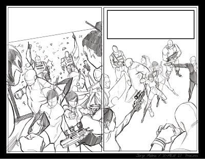
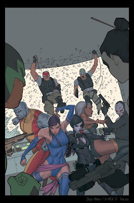
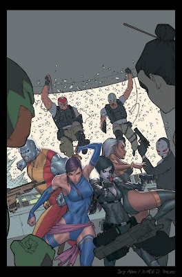
These are the two composition sketches I did for the marvel editors, the concept I was given was to the depict the X-MEN surrounded by assassins. The image on the right was the first concept I nailed but the second one was the best choice since it's a much tightened shot and has more sense of danger.
Both of these images where done in a Photoshop CS5 with the Cintiq, I feel very comfortable doing the initial sketches since its easier to edit when needed.
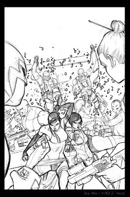
At these point I keep polishing the sketch till I get to the level of detail that I want, I already know that I don't want any shadows in the image, all I want is to play around with line work and leave all the shading to the colors. Again, all these is done with the Cintiq and I really don't put any attention to the line quality of my work, all I look for is to have the composition and the details I need to polish the image on the next step.
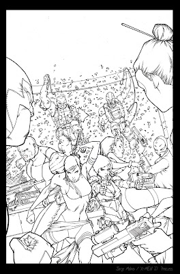
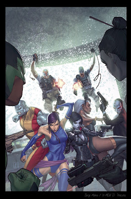
Then I print out the image above and trace it with the light table using H pencils and 11 x 17 bristol board, then I ink the pencils using Staedtler stylographs and a couple of brushes. All I focus in this stage is to have smooth lines and a good linework.
Then I scan the image back to the computer at 300 dpi on grayscale and use the levels on the Photoshop to clean the image.
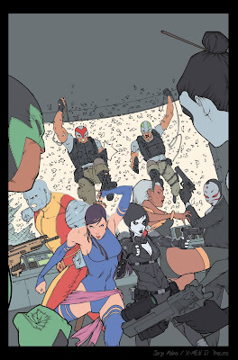
Once the levels are fixed I add a multiply layer to start laying the flats, this is the most boring part of the coloring process but is the most important since its the foundation of the image, I use a regular hard edge brush with 100% opacity and flow to cover all the areas. I tend to flat my character a one layer and my background elements on another for easer editing in the future.
Then I do a selection of the flats holding the ctrl button and clicking on the layer, this will select the entire layer so I can add another multiply layer and add a shadow tone for all my characters, this time I went for a green-gray shadow tone.
I didn't want to use a lot of contrast on my characters so I added 2 layer of shadows on multiply but lowering the opacity those ayers to have subtle shadows.
this process I do it with a customized brush that has a bit of texture with 70 opacity and 25 flow.
Then I start using lights just by adding layers on top on regular mode, since I wanted smooth transitions I didn't do a lot of mixing on light tones, I pretty much staid on the same tone values just by picking lighter colors and lowering my opacity on the layers.
Since I have two lights sources, one coming for the window an the other one for inside of the complex, I add a hard edge light on the back of my characters, this is a very helpfully lights since it makes the main characters pop, the second light is more subtle and helps to give volume to the characters.
Once I go trough all my lighting steps, usually using 3 layers of light, I merge all my colors leaving linework separated, this way I can polish the colors without disturbing
the lines, at this point I already have my color plate so it's all about adding details and polishing the image. After polishing all the details I star adding effects like glows and glares by using layers on lighten mode and overlay also using textures on a overlay mode with very low opacity on the layer.
Once y merge all the layers I do a color correction with the ctrl+u untill I get a color balance i'm
satisfied with.
For previews on the following X-MEN titles follow me on:
Twitter @jorge_molinam
Facebook Fan Page
http://www.facebook.com/pages/Jorge-Molina/170336213026821Tumblr:
http://www.tumblr.com/blog/jorgemolinam


